
Announcements
$5 for Every Friend You Refer
Invite your friends to experience Price.com and jumpstart their savings with $5. It’s easy! When…
Share
4 years ago
Today, we are excited to announce to our customers that Price.com has a new look. We’re always striving to improve the experience for our users and felt that it was time to revamp our brand with a simpler, easier to use design, with a more modern aesthetic and joyful brand presence. We’re happy to share these brand updates and why we made them.
We’ve updated our design across all of our channels, including our website, browser extension, mobile, social media and marketing. Our aim was to create a more consistent experience across all of our brand touchpoints. Starting with a blank canvas and the below concept, “the joy of saving money,” we are proud to present our updated logo, typeface, colors, photography and illustrations. Though the brand has been entirely refreshed, our user experience and focus on savings remains the same.
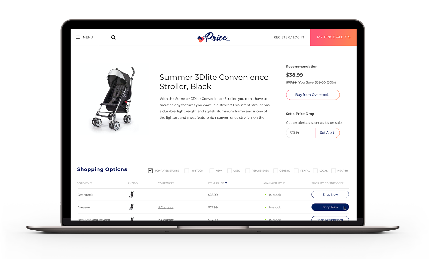
Price.com is a leading platform for saving money. Today, we are proud to offer our users the most ways to save money on one platform, including: product comparison, coupons, price alerts, price history and cash back. As our platform has expanded and evolved, we saw the need to integrate all of these money saving features into an easy and simple to use experience.
Refreshing our design is the perfect opportunity to hone in on our brand identity and our promise while improving the overall user experience.
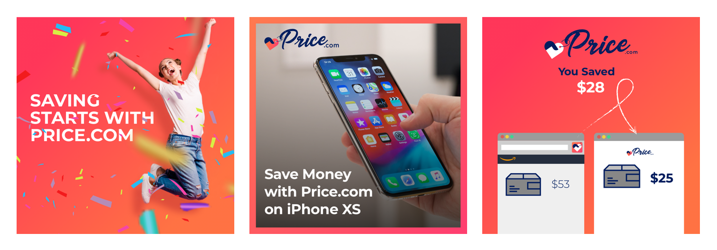
Overall Concept: The Joy of Saving
The concept driving our overall design is the joy one feels the moment they’re saving money. People can spend hours comparison shopping, hunting for coupons and visiting multiple websites in search of a deal. Our aim is simple: make it easy for consumers to see the best price and to save the most money.
OUR NEW LOGO
Our new logo is written in script to capture a friendly and joyful presence. The logo gently slopes upward further reinforcing the energy and movement we were looking to capture.
![]()
Previously, our icon design was created for an app on the mobile phone and was a very simple capital P with a period. The icon wasn’t always recognizable as Price.com and couldn’t hold its own as a brand mark. Through a process of iteration and refinement, we’ve developed a new icon that showcases a hand embracing a price tag. The two elements combine to create a heart. We strive to help customers find products they’ll love at the best prices. We love it when that happens.
![]()
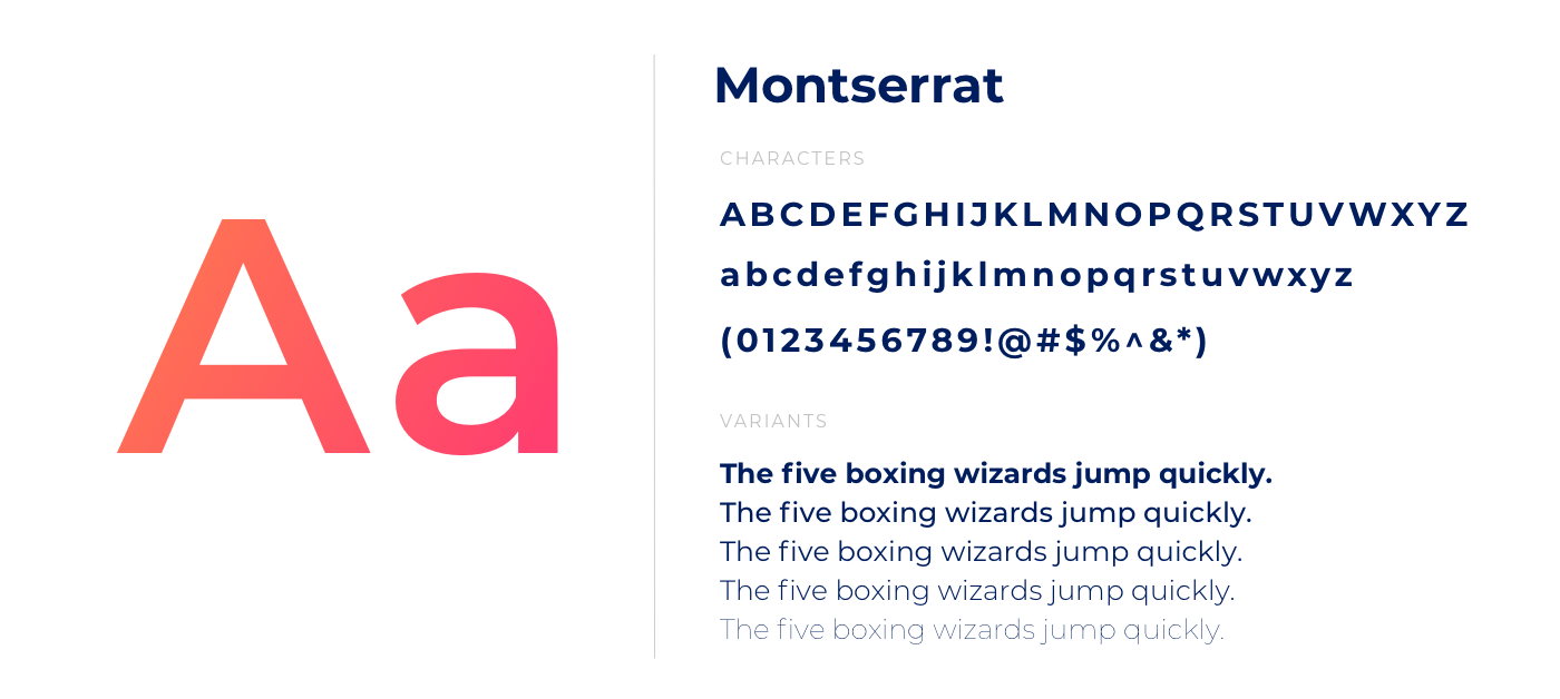
Julieta, the typeface’s designer lives and works in Montserrat, the first and oldest neighborhood in Buenos Aires. She’s inspired by her urban landscape and the typography within. She created this typeface that captures the work, dedication, care, color, contrast, light and life of this neighborhood, day and night! This is the typography that makes her city look so beautiful.
Just as a storefront would use bold typography to call attention and clearly communicate, we use this typeface as a bold way to bring life and clarity to our website and brand.
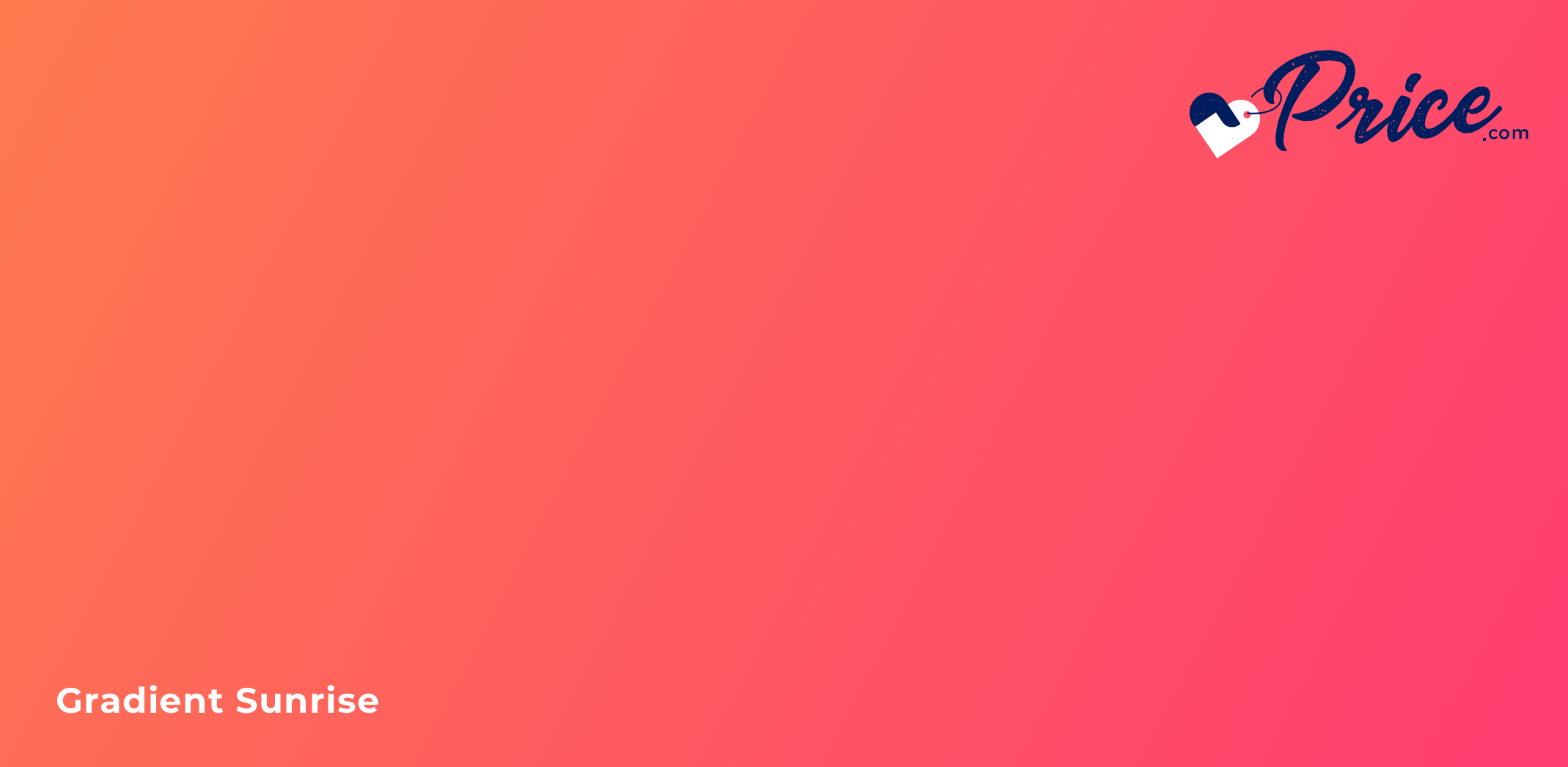
It’s an energetic color that brings a joyful brand expression. It helps us build recognition and memorable visuals. We use this color with a purpose to drive consistency across all our properties and marketing.
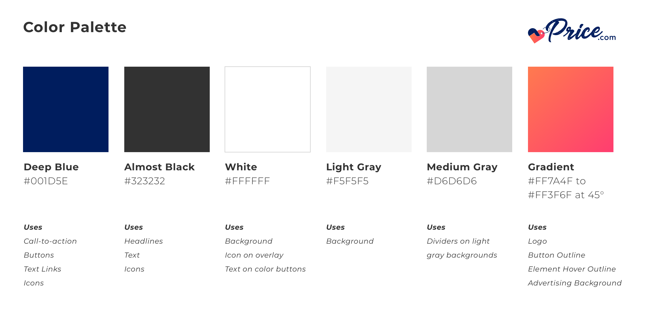
Our logo, color palette and typography provide the ties that hold our look together. They ensure Price.com is recognizable wherever it appears.

Invite your friends to experience Price.com and jumpstart their savings with $5. It’s easy! When…
We’ve scoured 1 billion products to curate the best Black Friday deals. Save on televisions,…
